Visualizing flow of patients in Oncoguide using Sankey diagrams
At IKNL, we work everyday to continuously improve oncological and palliative care of the Dutch population. We have developed Oncoguide, a tool that supports healthcare professionals and patients in making the best decisions for their treatment. Oncoguide provides a graphical representation of clinical guidelines for patient therapy in the shape of decision trees.
We wanted to generate a graphical representation of the flow of patients through the decision trees. Namely, we were interested in seeing the amount of patients that were treated according to the guidelines and the amount of patients that were not. We used floWeaver to generate Sankey diagrams like the one shown below.
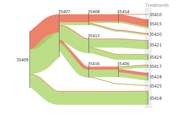
This is an example of a decision tree for prostate cancer. Each node of the tree represents a decision point. Based on his (disease) characteristics, the patient travels through the tree until he reaches a leaf, which represents a (suggested) treatment. In green, you can see the patients that were treated according to the guideline, while in red you can see the patients that deviated from the guideline. This isn’t necessarily bad (usually the clinician has good reasons to do so), but it gives us a good idea of how patients are treated.
The floWeaver code to produce this diagram is available on Github. Furthermore, you can access Oncoguide here. It is free of charge and creating an account is optional. Look for the English version on the bottom of the main screen!